Make the buttons on the flashcard queue's top bar customizable
Here is how the top bar of current flashcards’ queue looks:

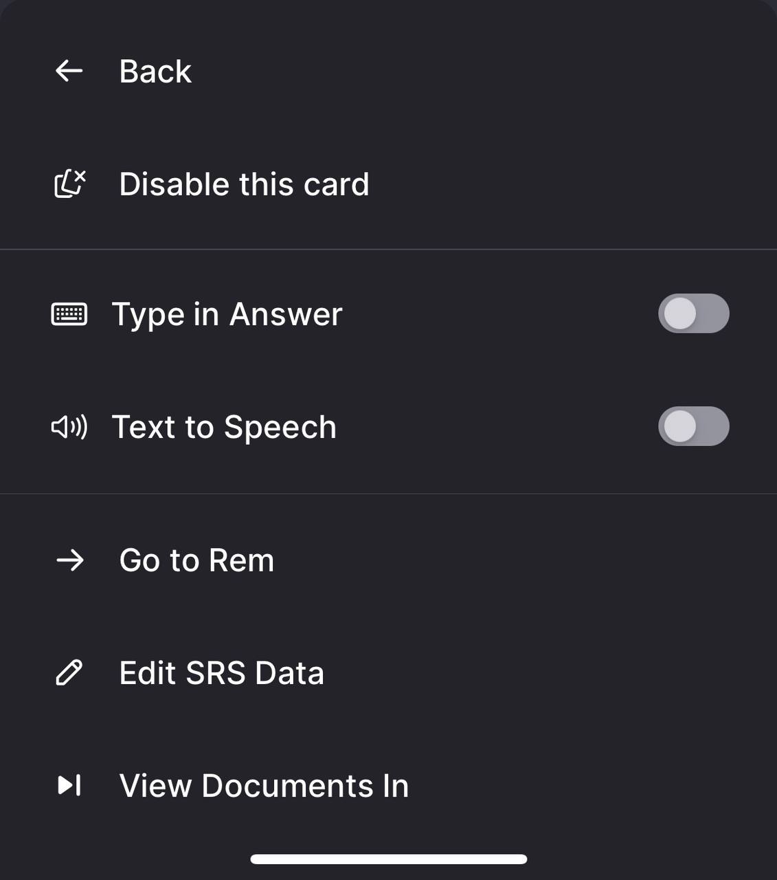
I’ve highlighted the important area with square. There is enough space for at least 2 more buttons. Here is the menu after clicking on 3 dot’s button:

“Back” button here is the most frequent action I use, meaning, I have to do 2 taps (3 dots - Back) for the most frequent interaction with the card’s queue; even more, considering app (in my case) almost exclusively used for flashcards, this is the second most frequent interaction after choosing an answer.
Adding a customization option to select which buttons are present directly at the top bar would be really useful.
Subscribe to post
Get email updates when post changes
Post Information
Posted by
Uzzer
Board
Feature Requests
TagsCustomization / PersonalizationFlashcard Queue
Posted on
Upvoters
+1
Downvoters